
For years, many senior-serving businesses treated website accessibility as an afterthought. It was something you did to avoid a lawsuit. It was a compliance box to check.
In 2026, that mindset is a liability.
Accessibility is no longer just about legal compliance. It is a core pillar of SEO. If a 78-year-old with cataracts cannot easily read your pricing page, Google knows it. They will penalize your rankings for it.
SEO is not a game to be won
I have spent nearly a decade in senior care marketing. Before that, I was in the trenches of social services. I've seen how families make decisions.
In my work at Greatness Digital, I tell my clients one thing: SEO is not something to be "gamed." It is a concentrated effort to give someone the best and most seamless experience based on their intent.
When we perform tests on senior-serving websites, the data is clear. When we fix accessibility, we almost always see double-digit growth in engagement and click-through rates.
Why? Because when a website is easy to use, people stay.
The metrics that matter
The "Aha!" moment for most owners comes when they look at two things: dwell time and bounce rate.
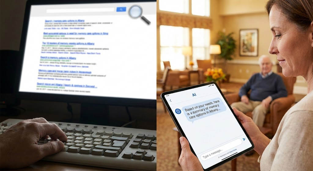
If a daughter is looking for memory care, she has "commercial intent." She wants answers. If your site is accessible, she stays and reads. That is dwell time. If your site is a mess of tiny fonts and annoying animations, she leaves. That is a bounce.
Google sees this. If people leave your site quickly, Google assumes your site isn't helpful. Then, they stop showing it to other families.
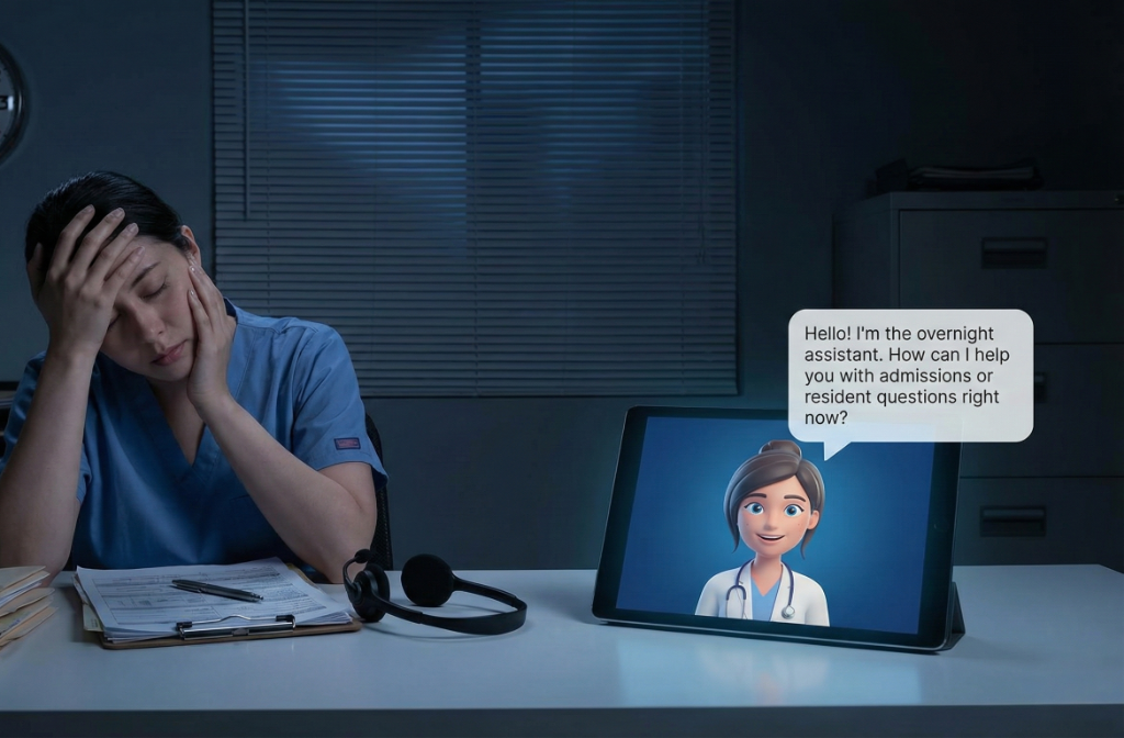
Accessibility is empathy in action
When a company comes to us and asks about accessibility first, it tells me something. It shows they actually care about their brand and their residents.
It aligns with your care philosophy. If you claim to provide "person-centered care," that care should start on your homepage.
But it's also about protection. A truly accessible website doesn't just welcome seniors. It protects your company from frivolous lawsuits. It's good for your heart, and it's good for your bottom line.
Don't hide the milk
My biggest pet peeve is "trendy" design.
I see websites with scroll animations that jump around or fonts that are too small to read. But the worst offense is moving the "core elements."
We have all been trained to look for the menu at the top and the contact info at the bottom. When designers get "creative" and move those things, they frustrate the user.
Think of it like your favorite grocery store. If you walked in today and they moved the milk and cheese to the middle of the store—and then hid them behind a wall of cereal—you'd be annoyed. You might even leave.
Your website is no different.
How to stay ahead
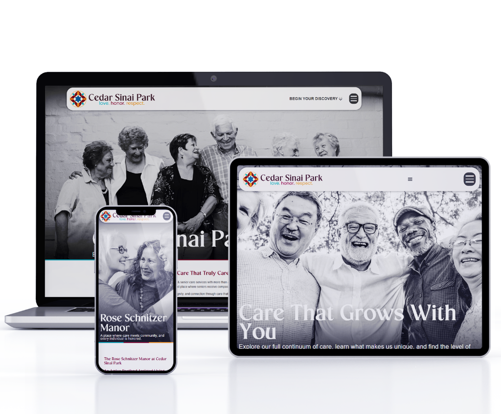
At Greatness Digital, we ensure that accessibility is paramount. We don't just build websites that look good. We build websites that work for the people who need them.
Stick to the standards. Put your navigation where people expect it to be.
Focus on the user's intent. Give them the information they want without making them hunt for it.
Make it readable. High contrast and large fonts aren't optional in 2026.
You focus on the care. I'll make sure your website is the most accessible, authoritative "front door" in your market.